Halloween is the shortest selling window in the retail calendar that still gets its own product. Shelves fill in the last week of September, demand peaks in the third week of October, and on the first of November the same product is a markdown.
That length is the whole design constraint. Anything you build into a Halloween capsule has to earn its cost inside three weeks, or be something you were going to make anyway.
Put the season in the thin layer#
The useful split is between the body and the surface. The body — silhouette, size, gusset, zipper, lining, label placement — is where development time goes. The surface — print, colourway, puller, seasonal label — is where the season lives.
A capsule that changes only the surface can be decided late, made alongside a year-round style and, if it does not sell through, stripped back to a product that still makes sense in November. A capsule that changes the body cannot do any of that.
Why the pumpkin-shaped pouch is a trap#
Novelty silhouettes are the first idea in every Halloween brief and the one that costs most. A shaped body needs its own pattern, its own sample round and its own packing, and at the end of October it is unsellable at any price and cannot be carried into next year without looking like last year's.
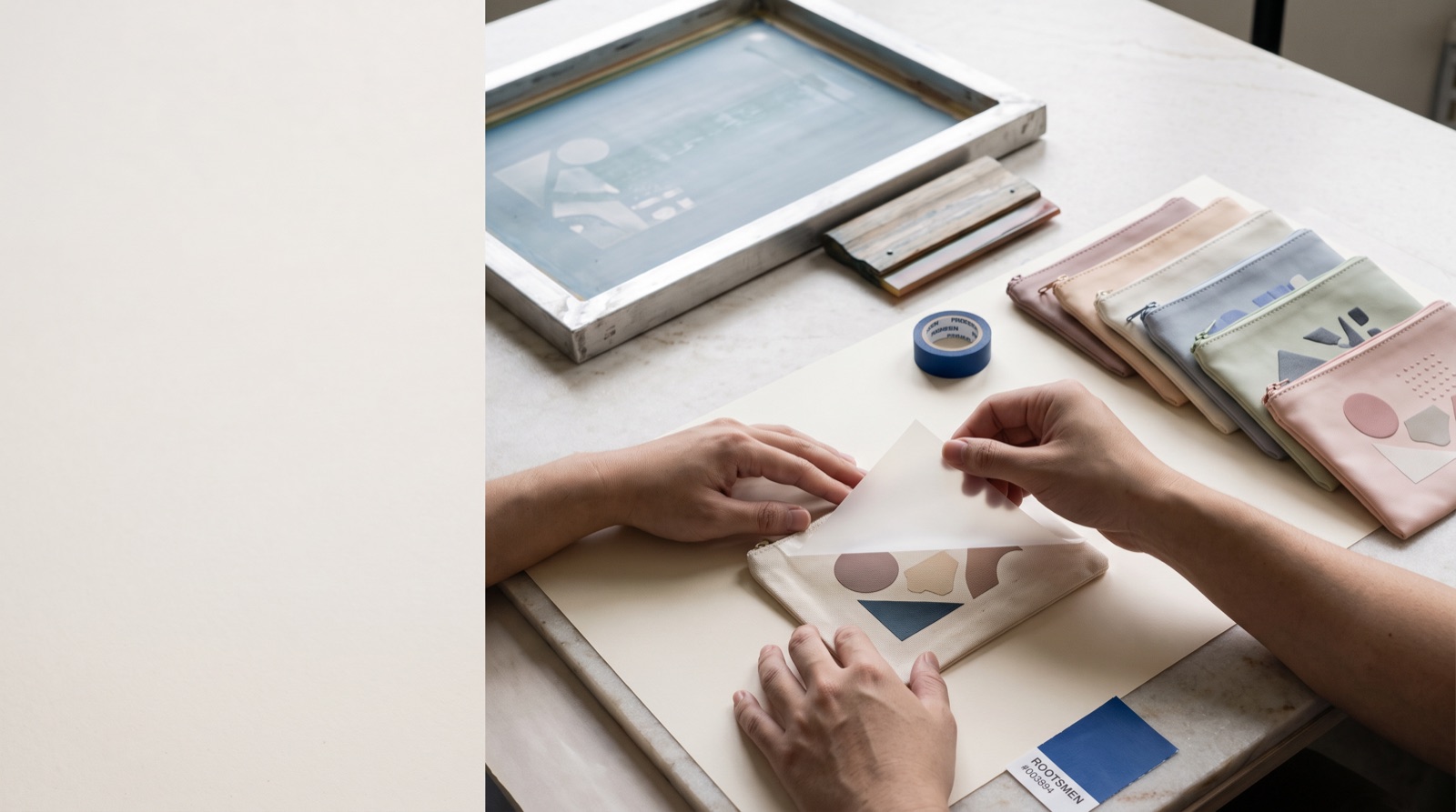
The same idea works as artwork on a rectangular pouch, where it costs a screen rather than a development, and the body underneath goes on being useful.
Orange and black are not as easy as they look#
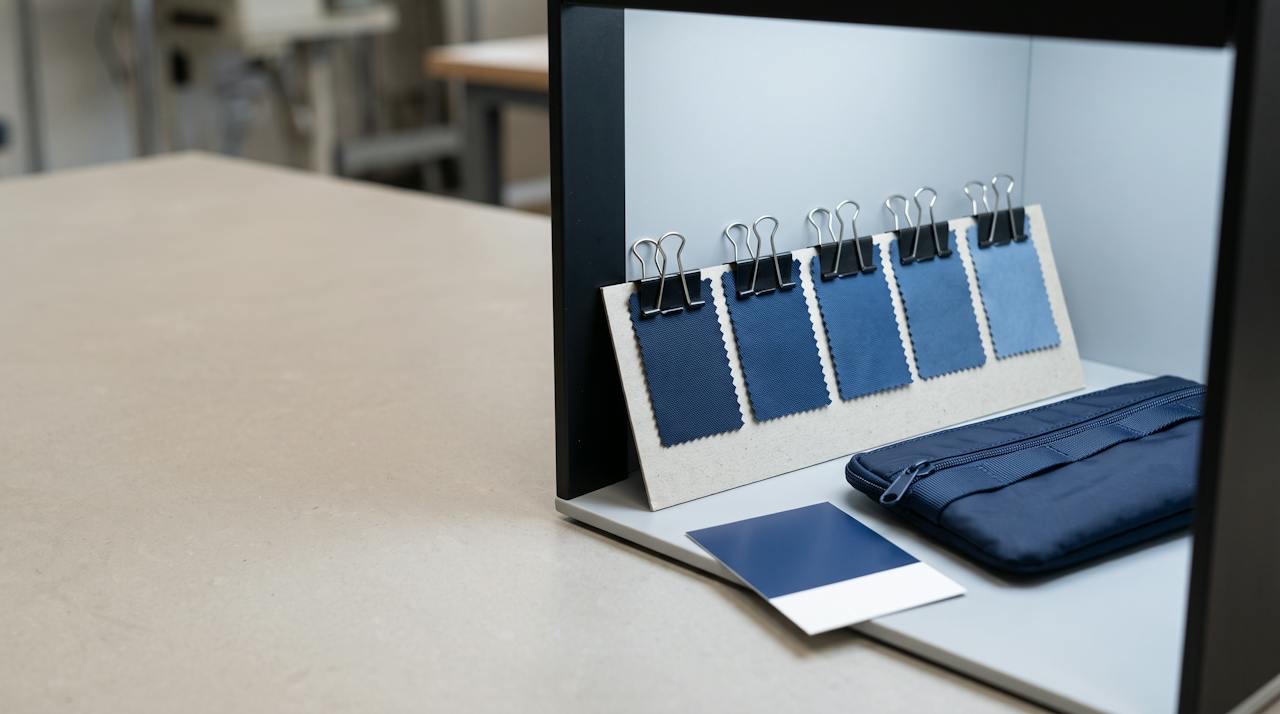
Both are harder to match than mid-tones. Black reads differently on a matte coated shell than on a quilted polyester, and two blacks beside each other on the same product will not look like one black. Orange sits in the part of the range where dye lots move most visibly between batches.
If the capsule mixes materials — a coated body with a canvas panel, say — approve them together rather than separately, and expect to accept a tolerance rather than an exact match. Colour matching and why colours shift explains why.
Decide what happens on 1 November before you start#
Every seasonal capsule has a leftover plan whether or not anyone writes it down. Writing it down changes the design. If leftovers go to staff gifting, the artwork can be bolder. If they are meant to sell through in a clearance, a colourway that works without the season helps. If there is no plan, the honest move is to make the seasonal layer thinner.
This is the same discipline as briefing a counter GWP pouch without overbuilding: decide what the piece has to do, and stop building once it does it.
What to put in the brief#
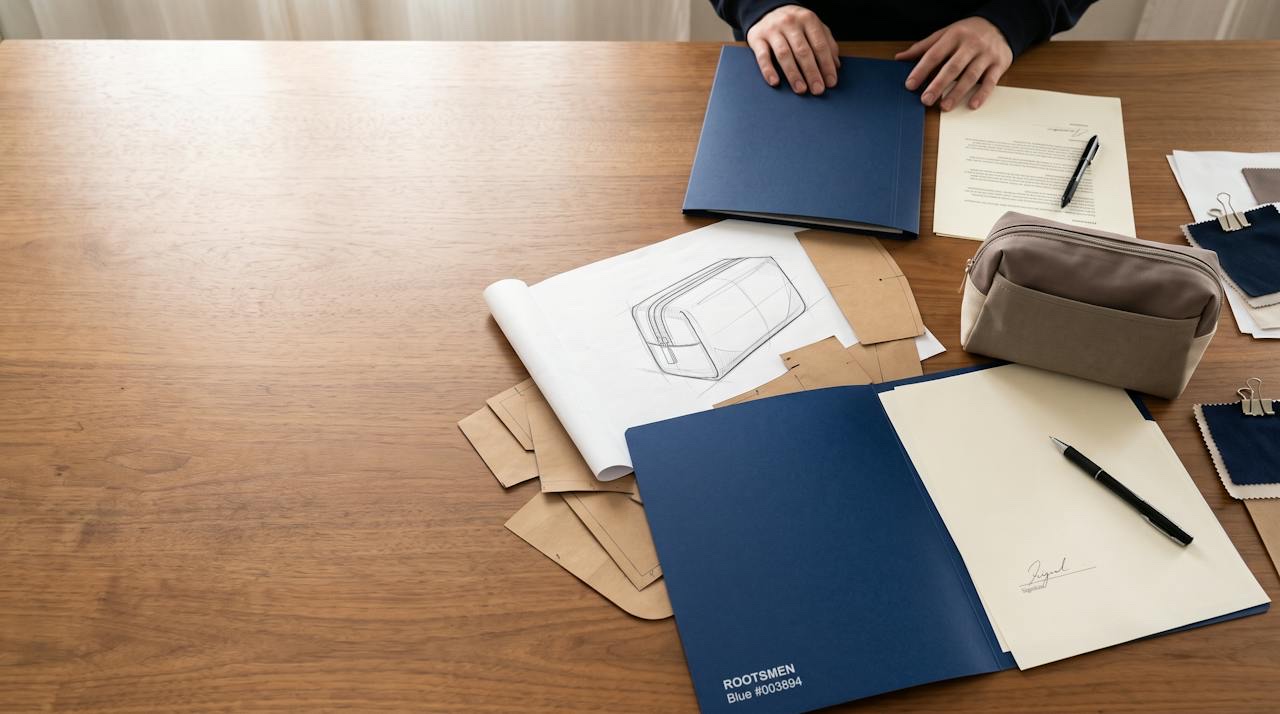
Name the year-round style the capsule is based on, then list only what differs: the artwork and where it sits, the shell colour, the puller, the label. Say explicitly that the body is unchanged, because that sentence is what keeps a short run short.
If the capsule is for a licensed character, the artwork rules are their own subject — what a soft-goods factory needs from an IP style guide covers what has to arrive with the files.
| Element | Good place for the season | Why |
|---|---|---|
| Print / artwork | Yes | Changes cheaply, carries the whole seasonal signal |
| Shell colour | Yes | Orange, black and deep purple read instantly without new tooling |
| Zipper puller | Yes, sparingly | A small part, swapped easily, noticed at close range |
| Woven label | Yes | A seasonal label on a year-round body is a cheap signal |
| Body silhouette | No | A novelty shape has no life after October and no carry-over |
| Hardware and construction | No | New construction means new development for three weeks of selling |