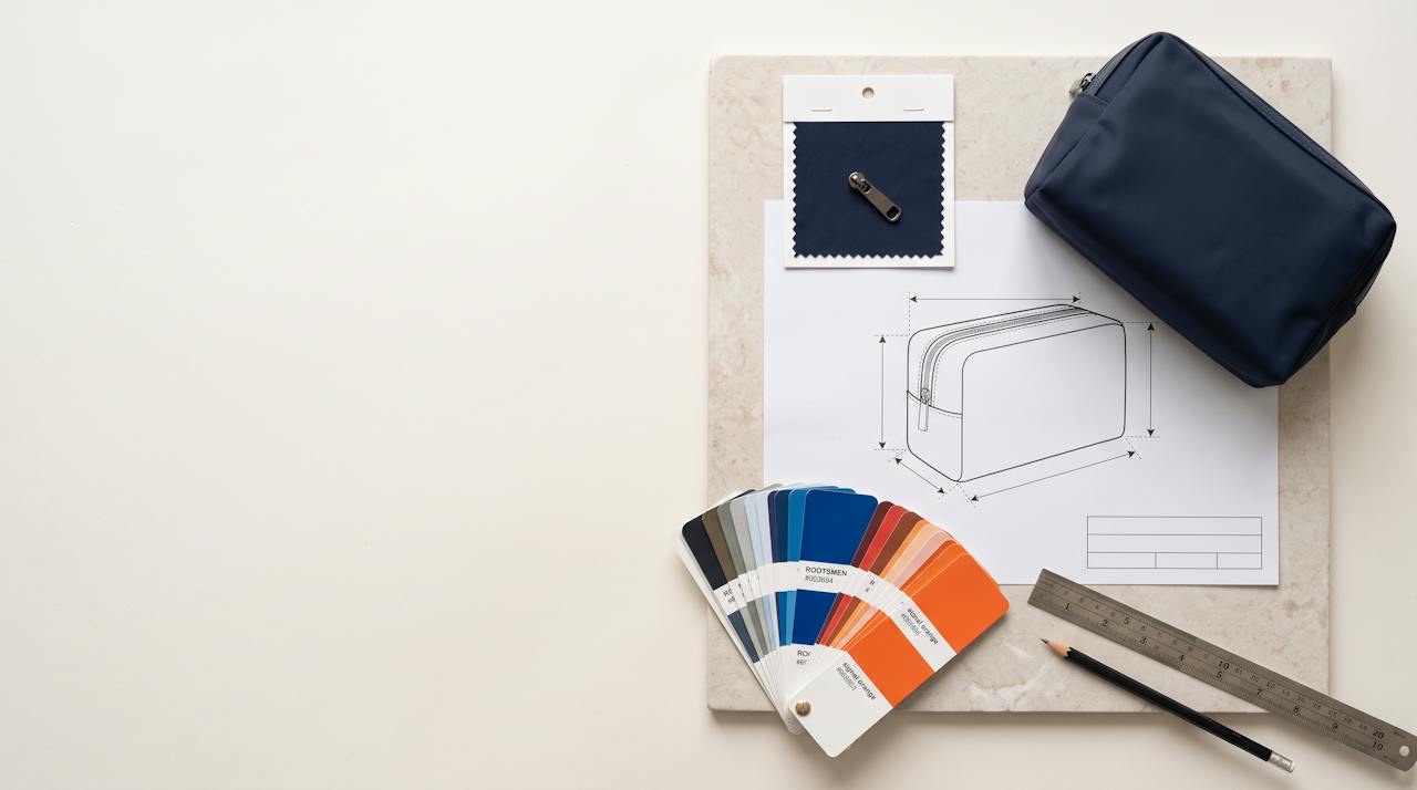
Every colour conversation about a bag ends up in the same place: somebody says "navy" and three people picture three different navies. A Pantone number fixes that. It turns a word into a reference that a designer in one city and a dye house in another can both hold in their hand.
What it does not do is make the colour happen. Fabric is dyed, not printed from a file, and the same target lands differently on nylon, polyester, cotton and PU. The number is where the matching starts. This note covers which number to quote, how to read it, and how to get from the number to a batch you are happy with.
Two Pantone systems, and why bags use both#
Pantone publishes two families of colour guides that matter here. The Fashion, Home + Interiors system is built for textiles; its colours carry a six-digit number and a suffix — TCX when the reference is dyed cotton, TPG when it is printed on paper (TPG succeeded the older TPX). The graphics system, the one printers use, gives colours a shorter number with C for coated paper or U for uncoated.
A bag sits across both. The shell, lining, webbing and zipper tape are dyed, so they belong to the textile system. The logo, the hangtag and the box are printed, so they belong to the graphics system. A brief that quotes a graphics code for a nylon shell is asking a dye house to match ink on paper — possible, but it adds a translation step that a textile code avoids.
How to read a textile code#
A textile number such as 19-4052 TCX is not random. The first two digits give the lightness, from 11 for the lightest colours to 19 for the darkest. The middle pair places the colour in a hue family around the colour wheel, and the last pair positions it within that family. The suffix tells you what the reference itself is: TCX on cotton, TPG on paper.
That structure is useful in practice. Two colours that share their first two digits sit at about the same depth, which is a quick check that a two-tone bag will read as intended rather than as one muddy shade. And a jump in the first pair warns you that a "slightly darker" request is really a different colour.
One number, several materials#
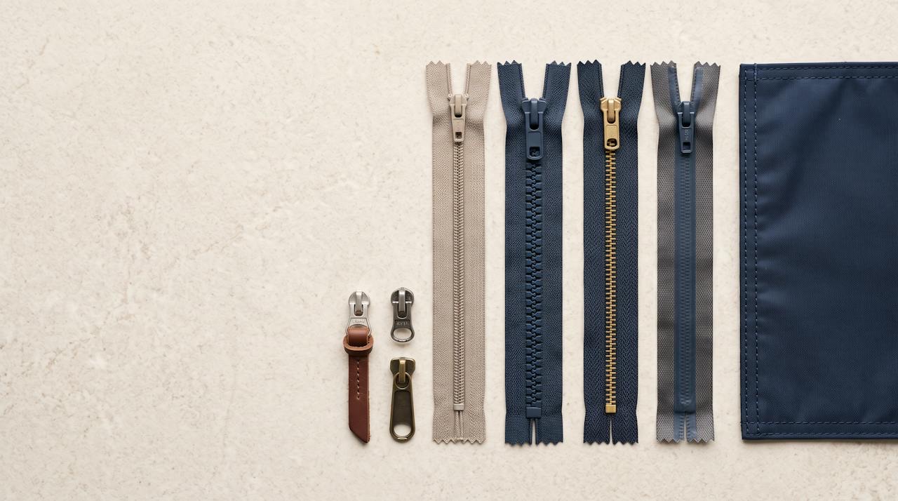
A single bag can carry the same colour on five components, and each one is coloured by a different process: a woven shell is dyed, a coated or PU shell is coloured in the coating, the webbing and thread are dyed as yarn or tape, and the logo is printed. Each lands on the target in its own way, and some — zipper tape and pullers especially — are often chosen from the zipper maker's own colour card rather than dyed to order.
So list each component with its colour, rather than writing one number at the top of the brief. Say which parts must match exactly and which can be the nearest standard option. The table above shows which library fits which part; how to choose a zipper covers the hardware side.
From the number to an approved lab dip#
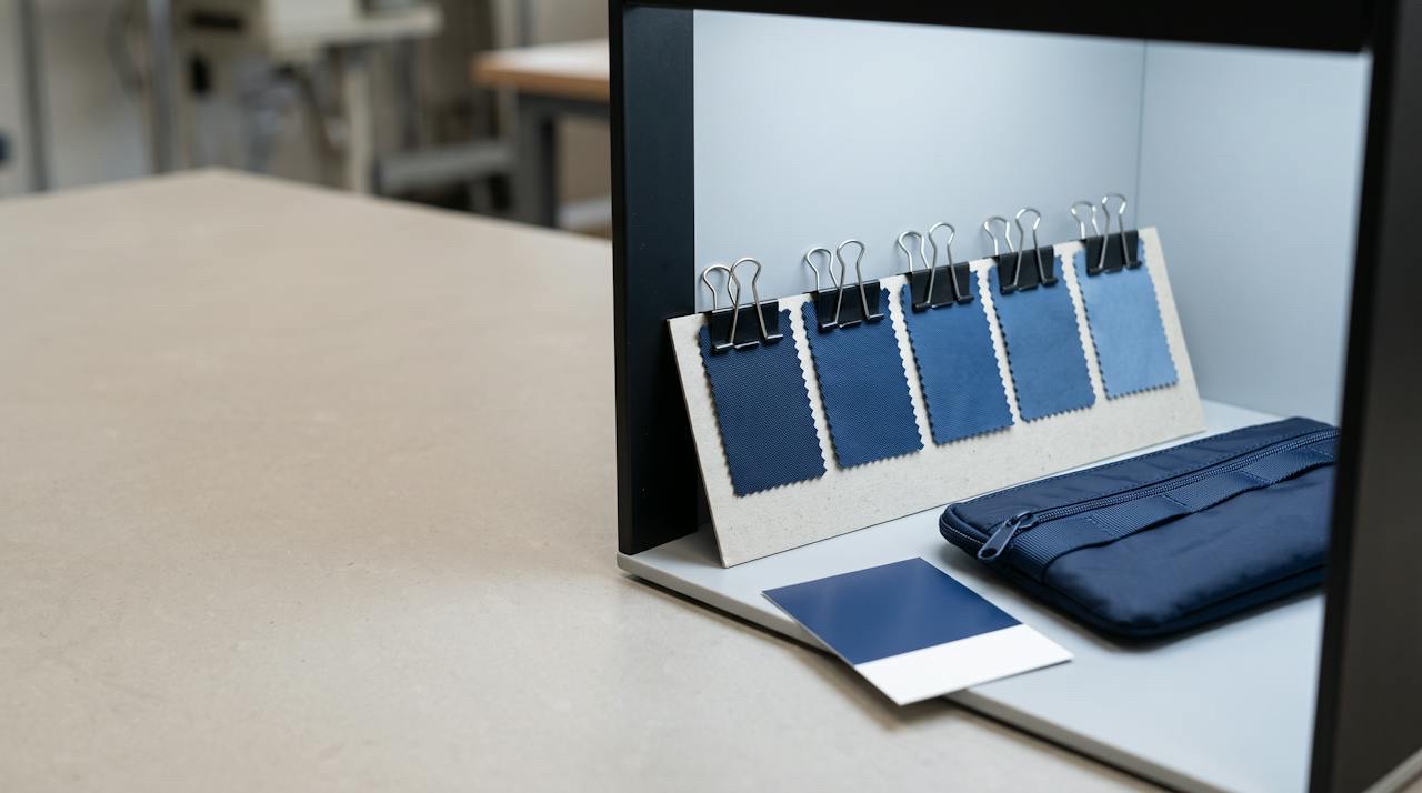
The factory, or its dye house, dyes your actual material to the target and sends back a small swatch — a lab dip. Often there are two or three options either side of the target. You choose one, or ask for another round, and the approved dip becomes the reference for bulk.
Approve dips in agreed light, not by a window and not on screen. Colours that match in daylight can split under shop lighting — the effect called metamerism — so say which light matters for your product, and keep the approved dip as the standard the bulk is checked against. The mechanics, including why colours shift between batches, are in colour matching, lab dips and why colours shift.
Screens, PDFs and physical swatches#
A Pantone number on a PDF is reliable. The colour the PDF shows you is not: every monitor and phone renders it differently, and the RGB or CMYK value next to a Pantone name in design software is an approximation for screen and print, not a dyeing recipe.
If a colour matters, send the number and, where you can, the physical reference — a Pantone swatch, a fabric you already sell, or a previous product. A real object removes more argument than any amount of description. If you are matching an existing product, say so; matching to a previous batch is a different job from matching to a guide.
Pale colours, whites and the 2026 Colour of the Year#
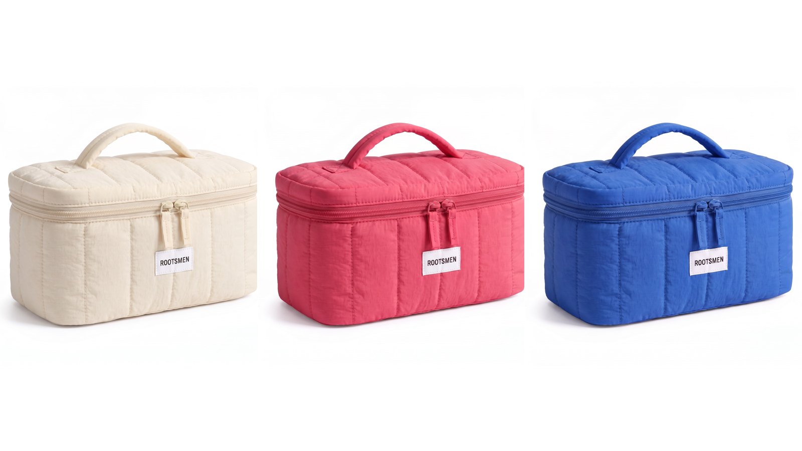
Pantone's Colour of the Year for 2026 is PANTONE 11-4201 Cloud Dancer, the first white the programme has chosen. Expect to see soft whites and creams in briefs as a result — and expect them to be harder than they look. Pale colours show every difference between batches, between the shell and the trims, and between a dyed fabric and a printed label.
With whites, settle three things early: whether the white should be warm or cool, how it will be kept clean through production and packing, and whether the lining and zipper should match it or deliberately contrast. Our note on pastel capsules makes the same point for pale colours generally.
What to put in the brief#
A colour brief that moves quickly lists every component with its colour reference, names the library for each (TCX or TPG for dyed parts, C or U for printed ones), marks which parts must match and which may use the nearest standard colour, states the light the colour will be judged in, and says whether you are matching a guide or an existing product.
Everything else follows from that. If you want a full structure to copy, how to write a tech pack for a cosmetic bag has a place for every line above.
| Library | Suffix | Printed on | Quote it for |
|---|---|---|---|
| Fashion, Home + Interiors — cotton | TCX (e.g. 19-4052 TCX) | Dyed cotton swatches | Shell fabric, lining, webbing, zipper tape, thread — anything dyed |
| Fashion, Home + Interiors — paper | TPG (earlier TPX) | Paper | The same textile colours in a paper guide; handy for briefs and mood boards |
| Graphics, coated paper | C (e.g. 286 C) | Coated paper | Screen-printed or transferred logos, glossy hangtags, printed boxes |
| Graphics, uncoated paper | U (e.g. 286 U) | Uncoated paper | Kraft or matte hangtags, uncoated inserts and packaging |